
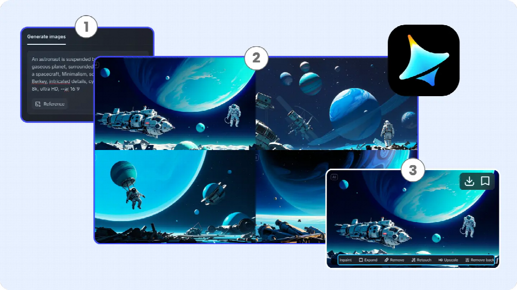
You have an idea for a picture: a quiet reading corner, sunlight on a chair, and a book waiting on a small table. But finding an image that looks the way you imagined can take time. An ai image generator lets you describe that scene in words and turn your description into a new visual, even if you have never used design software.
This guide walks through the process from the first idea to a usable image. Along the way, you will see how a short description can evolve, what to do when the result misses the mark, and what to check before sharing it.
What Is an AI Image Generator?
An AI image generator creates images in response to instructions. Most tools accept a text description, usually called a prompt. Some also let you upload an image as a reference or starting point, depending on the available features.
Think of the prompt as a creative brief, not a command that guarantees an exact result. If you ask for a reading corner, the tool makes choices about the chair, the room, the light, and the arrangement. Add more information and you can guide some of those choices, but the result may still surprise you.
You do not need to understand how the underlying model works to start. You do need to review what it creates: a convincing-looking image can contain invented details, distorted objects, or information that is simply wrong.
What Can You Create?
AI-generated images can be useful whenever you need an illustrative visual and an exact photograph is not essential. For example, you might create a conceptual image for a blog post, a background for a presentation, a visual for a social post, or an illustration to explore an idea for a project.
The same subject can take many forms. A reading corner might become a soft watercolor for a book club post, a clean digital illustration for a website, or a realistic-looking scene for a mood board. The choice depends on what the image needs to do and where it will appear.
There are limits. A generated picture of a real hotel room, product, or event venue should not be presented as an accurate photograph. If the audience needs to see what something actually looks like, an authorized photograph is usually the better starting point.
How to Create Your First AI Image
To make the process concrete, let’s create an illustration for an article about making time to read. We will keep the same scene throughout, so it is easier to see what changes when the instructions change.
1. Start With One Simple Idea
Open Dreamina’s image creation tool and look for the text-to-image prompt field. The exact labels, available models, and settings may vary with the interface or account, but the basic task is the same: enter a description and generate an image.
Start with a subject you can picture. For this example, you might type: “A cozy reading corner with a chair and a book.”
That is already a usable prompt. It tells the generator what to include, but leaves many decisions open. You may get a modern apartment, a library, or a garden nook; the chair could be close up or small in a wide room. This flexibility can be useful when you want to discover possibilities rather than reproduce a fixed idea.
Before generating, choose an image shape if the tool offers that setting. A wide image can work for an article header, a square image for a social post, and a vertical image for a phone-oriented layout. The destination’s actual size requirements may differ, so check them before final export.
2. Add Details That Matter
Now imagine that the image needs to sit beside an article headline. You want a calm scene, an obvious place to read, and some open space for the layout. A more specific prompt could be:
“A cozy reading corner beside a large window, with a cream armchair, a small wooden side table, and an open book. Soft morning light, warm neutral colors, and a calm atmosphere. Wide composition with open space on the left for a headline. Digital illustration.”
Notice what changed: the description now includes the setting, important objects, lighting, mood, composition, and visual style. You do not need all of these in every prompt. Include the details that will affect whether the image works for your intended use.
If you are unsure what to specify, answer three questions in plain language: What should the image show? What should it feel like? Where will it appear? Those answers are often enough to build a useful first description.
The instruction to leave room for a headline guides the composition; it does not place a finished headline into the image. Generators may produce inaccurate lettering, so add important words separately and check spelling and contrast in your final layout.
3. Generate and Review the Result
Enter the description, select the available settings that suit the project, and use the generate control. Once the image appears, look at it in two ways: first as a small thumbnail, then at a larger size.
At thumbnail size, can you immediately recognize a reading corner? Is the chair easy to see, and is the space for the headline actually clear? At a larger size, inspect the book, furniture, and window. Look for objects merging together, strange shapes, and details that distract from the scene.
If the tool offers multiple results, compare them against your purpose rather than choosing only the prettiest one. One image may have beautiful light but no room for the headline; another may be less dramatic but fit the article much better. Save a promising version before experimenting further, and download the final image when you are ready to use it.
What If Your First Image Is Not What You Expected?
An unexpected result is information: it shows which part of the idea needs a clearer instruction. Change one important thing at a time so you can see what helped.
The Scene Is Too Busy
If bookshelves, plants, and decorations compete with the chair, make the main subject more explicit: “A single cream armchair beside a window, with a small side table and an open book; simple background with few decorative objects.”
You can also ask for a closer view or a quieter background. Neither wording guarantees the result, but both give the tool a clearer direction than simply asking for a “better” image.
The Mood or Style Feels Wrong
If the room looks dark and dramatic when you wanted a light, relaxed mood, replace vague words with visible details: “soft morning daylight,” “warm neutral colors,” and “gentle shadows.” If a realistic image feels too much like a stock photograph, try “hand-painted watercolor illustration” or “simple editorial illustration.”
Change the style while keeping the subject and composition similar. This makes it easier to compare the visual treatment rather than judging several completely different scenes.
The Details Do Not Hold Up
Look closely at the details relevant to the image. A book may have nonsensical writing, a chair leg may disappear, or a cup may blend into a table. If the flawed detail is central to the scene, try regenerating with a simpler description or use an editing option to revise the area if one is available.
For text, logos, and exact product features, do not assume the generator will reproduce them accurately. Add verified text afterward and use an authorized source image when accuracy is essential. If repeated attempts fail, changing the composition can be more effective than adding a longer list of instructions.
Ways to Experiment With Your First Idea
Once you have one workable image, use it as a starting point for learning. Small, deliberate changes can show you what the generator responds to without requiring an entirely new concept.
Try a style comparison: keep the reading corner and morning light, but request a watercolor illustration in one version and a clean, flat illustration in another. Then compare how each one would look next to the same article headline. A softer image may create a more reflective mood; a simpler one may remain recognizable at a smaller size.
Next, try changing the framing. A wide view reveals the room and leaves more room for a headline. A close-up of the book and chair can make the activity feel more immediate. If you need a vertical social image, generate for that shape rather than relying on a crop that removes the subject.
Some workflows allow a reference image. If you have permission to use a photograph of your own reading corner, you could use it to guide a new visual direction and describe the desired changes. Treat the result as an interpretation: the tool may alter furniture, colors, or layout rather than preserving every detail.
Keep a short note of the prompt and settings for versions you like. This makes it easier to revisit a direction later, although using the same description again may produce a different image.
What to Check Before Using or Sharing an AI Image
A good-looking image still needs a final review in the place where people will see it. Check the crop and readability on both a large screen and a phone, particularly if you add a headline. If the visual carries information not explained in nearby text, provide a useful text alternative where the platform supports it.
Consider accuracy and context. An illustrative reading corner is unlikely to require the precision of a real location, but an image presented as evidence of an event or as a photograph of a product can mislead. Label an image as illustrative when needed, and follow the publication’s disclosure rules.
If you upload a reference photo, make sure you have the necessary permission and avoid including private or sensitive material. Review the tool’s current terms and the rules of the destination where you plan to publish, especially for commercial use; permissions can depend on the material and the way it is used.
Your First Image Is a Starting Point
The first result does not have to be perfect. Begin with one clear idea, generate a version, and compare what you see with what you intended. Then adjust the subject, setting, style, or composition based on a specific problem. With each round, you learn how to describe your ideas more clearly—and how to choose an image that actually fits the place where you will use it.
